Quick Answer: CMYK vs RGB
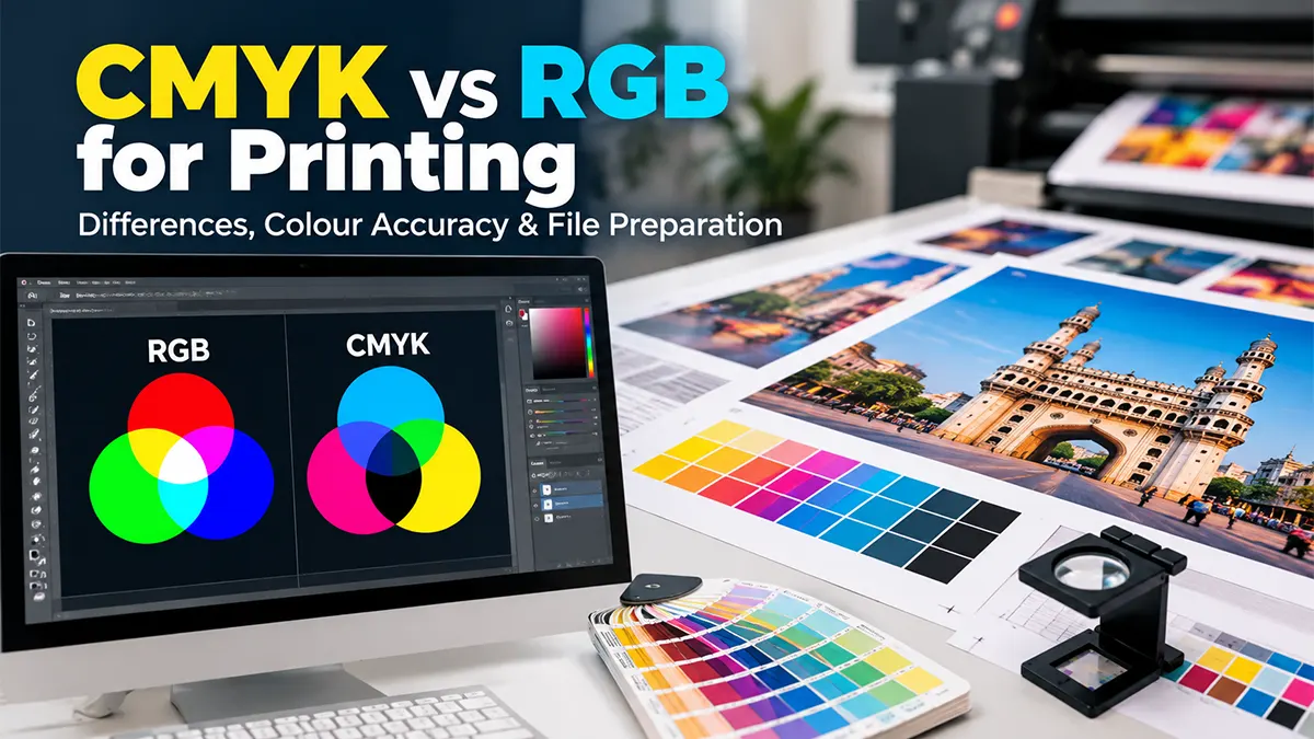
RGB stands for red, green and blue and is primarily used for displays and other light-based digital workflows. CMYK stands for cyan, magenta, yellow and key/black and is used for four-colour process printing.
For commercial printing, the correct workflow depends on the printer, press, paper, colour-management system and required output condition. Adobe specifically advises designers to check the requirements of the prepress provider rather than assuming that every print job must be converted to CMYK at the same stage.
What Is RGB?
RGB is an additive colour model. A display creates colour by controlling the intensity of red, green and blue light. In a typical 8-bit-per-channel RGB image, each channel can contain values from 0 to 255, creating a large range of possible colour combinations.
RGB is common for websites, social media graphics, screens, presentations, digital photographs and other screen-based applications. Adobe recommends sRGB as a practical choice for many web-oriented workflows, while wider-gamut RGB spaces can be useful in appropriate print workflows.
What Is CMYK?
CMYK is a subtractive colour model based on four process inks: cyan, magenta, yellow and black. During printing, these inks combine on a physical substrate to reproduce colours.
CMYK is commonly associated with process-colour commercial printing such as brochures, flyers, business cards, posters, catalogues and many other printed materials. The exact printable colour range depends on the press, inks, paper and colour-management conditions, so CMYK is not one universal visual gamut.
CMYK vs RGB: Key Differences
| Feature | RGB | CMYK |
|---|---|---|
| Meaning | Red, Green, Blue | Cyan, Magenta, Yellow, Key/Black |
| Colour method | Additive light | Subtractive ink |
| Typical use | Screens and digital content | Process-colour printing |
| Channels | 3 colour channels | 4 process-ink channels |
| Bright screen colours | Can represent colours outside many print gamuts | Limited by the selected print condition |
| Best workflow | Digital display and image editing where appropriate | Print production when required by the output workflow |
The important point is not that one colour model is universally “better.” The correct choice depends on the destination and the colour-management workflow.
Why RGB Colours Can Look Different in Print
A monitor produces colour with light, while printed material reflects light from ink and paper. Some colours that look vivid on a screen cannot be reproduced exactly by a particular printing process.
When an RGB file is converted to a CMYK output condition, out-of-gamut colours must be mapped into the destination gamut. This can make certain saturated blues, greens, cyans or other bright colours appear less vivid after conversion.
Screen Appearance
A backlit display can make colours appear brighter and more luminous than a printed sheet.
Printed Appearance
Ink, paper, press characteristics and viewing conditions influence the final appearance.
What Is Colour Gamut?
A colour gamut is the range of colours a device or colour space can represent. RGB spaces can contain colours that a particular CMYK print condition cannot reproduce. Conversely, different print processes and spot colours can represent colours differently from a standard CMYK workflow.
This is why simply changing a document from RGB to CMYK does not guarantee exact colour matching. Colour management and the destination profile are important parts of the workflow.
Should You Convert RGB to CMYK Before Printing?
There is no single rule that applies to every printer. Adobe notes that some commercial prepress facilities prefer designers to provide RGB files with embedded profiles so the prepress system can perform the appropriate conversion. Other workflows may require a CMYK file or a specific PDF/X output condition.
Practical rule
Ask the printer or prepress provider which colour space, ICC profile and PDF standard they require before final export. Follow that specification instead of converting blindly.
CMYK Conversion: What Changes?
When RGB artwork is converted to a CMYK destination, the software maps colours into the selected CMYK colour space. Colours outside that gamut may change in saturation or hue. Black areas can also require attention because screen black and printed black are not produced in the same way.
Adobe recommends checking highlights, shadows and colour appearance after conversion and using proofing tools where appropriate.
What Is an ICC Colour Profile?
An ICC profile describes the colour characteristics of a device or output condition so colour-management software can translate colour information more predictably between devices.
For commercial printing, the printer or prepress provider may specify a profile that corresponds to its press and paper conditions. Adobe recommends discussing the colour workflow with the production partner and using the appropriate profile for the intended output.
Soft Proofing: Previewing Print Colours
Soft proofing uses a colour profile to simulate how a document may appear under a particular output condition. It can help identify colours that may change during printing.
A soft proof is not a guarantee of the final physical print. Monitor calibration, profile quality, viewing light, paper and printing conditions all affect the usefulness of the preview. For critical colour work, a physical proof may be appropriate.
CMYK, RGB and PDF Files
PDF is a file format, not a colour model. A PDF can contain RGB and CMYK objects depending on how the document was created and exported. The correct PDF settings depend on the printer's workflow.
Adobe describes PDF/X standards for commercial printing and notes that PDF/X-1a converts colours to the destination CMYK space, while other PDF/X workflows can preserve colour information and profiles differently. Always follow the printer's supplied specification.
How to Prepare a Print-Ready File
- Confirm the final size: Set the document to the required finished dimensions.
- Ask for the printer specification: Confirm colour space, ICC profile, bleed and PDF standard.
- Use suitable images: Check resolution and avoid unnecessarily low-resolution source images.
- Manage colour profiles: Preserve or convert profiles according to the agreed production workflow.
- Check typography: Verify fonts, text size and readability before export.
- Check black: Confirm whether the printer expects pure black or a specific rich-black construction.
- Inspect transparency and overprint: Review effects and overprint settings where relevant.
- Proof the file: Use soft proofing or a physical proof for colour-sensitive projects.
- Export to the requested PDF standard: Do not assume one PDF preset works for every printer.
RGB vs CMYK for Common Printing Projects
| Project | Practical Starting Point | Important Check |
|---|---|---|
| Business Cards | Printer-specified CMYK/PDF workflow | Brand colours, small text, bleed |
| Brochures | Print production colour workflow | Images, profiles, paper and proofing |
| Posters | Follow output device specification | Viewing distance and large-format colour |
| Website Graphics | sRGB/RGB | Screen consistency and file size |
| Social Media | sRGB/RGB | Platform display and compression |
| Large-Format Printing | Printer-specific workflow | Device, substrate, profile and viewing distance |
Common CMYK & RGB Printing Mistakes
Converting Without Checking
Blindly converting every file to a generic CMYK profile can produce unexpected results when the printer uses a different output condition.
Ignoring Embedded Profiles
Removing or replacing colour profiles without understanding the workflow can make colour management less predictable.
Trusting the Monitor Alone
A screen preview cannot fully reproduce every physical printing condition.
Skipping the Proof
For colour-sensitive work, checking a proof can reveal issues before the full print run.
How to Improve Colour Accuracy in Printing
- Use a calibrated and profiled monitor for colour-critical work.
- Keep the agreed ICC profiles embedded or managed correctly.
- Ask the printer about the exact press, paper and output condition.
- Use soft proofing where appropriate.
- Request a physical proof for projects where colour matching is important.
- Use printed colour references when a specific brand colour must be controlled.
- Keep the final approved file unchanged after proof approval unless a new proof is reviewed.
Adobe's colour-management guidance emphasises calibration, device profiles, coordinated colour settings and communication with production partners.
CMYK vs RGB: A Simple Decision Guide
Designing for a screen? Start with an appropriate RGB workflow, commonly sRGB for web-oriented work.
Designing for commercial print? Ask the printer for the required colour space, profile and PDF standard.
Colour-critical project? Use colour management and consider a proof rather than relying only on the monitor.
Unsure about conversion? Do not convert simply because “print means CMYK.” Confirm the actual production workflow first.
Frequently Asked Questions
Reliable References for Colour Management
Disclaimer
Colour reproduction varies with software, profiles, monitors, printers, inks, substrates, lighting and production conditions. This article is for general informational purposes and does not replace the technical specification supplied by your printer or prepress provider. Always confirm the required colour space, ICC profile and PDF standard before final production.
Preparing a Print-Ready Design?
Before sending artwork for printing, confirm the required colour profile, dimensions, bleed and PDF specifications with the printing provider.
Discuss Print Preparation