Quick Answer: Matte vs Glossy Printing
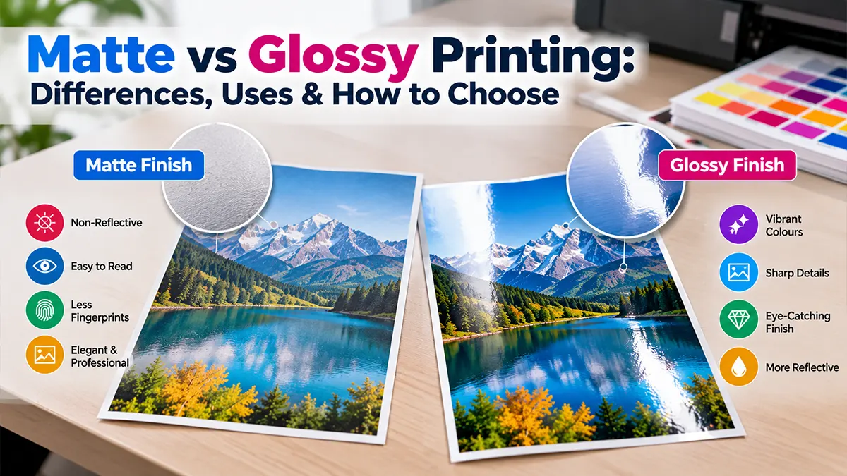
Matte printing has a low-reflection surface with a more subdued appearance, while glossy printing has a smooth, reflective finish that can make photographs and colours appear more vivid. Neither finish is universally better.
Choose based on the job: matte can be useful for text-heavy materials, display prints and situations where glare is a concern; glossy can suit photographs, image-led brochures and designs where colour impact is important. The actual result also depends on the paper, ink, printer and colour-management profile.
Matte vs Glossy: Key Differences
| Feature | Matte | Glossy |
|---|---|---|
| Surface | Low-reflection / non-shiny | Smooth and reflective |
| Visual Effect | Subdued, soft appearance | Vivid, high-impact appearance |
| Glare | Generally lower | Generally higher |
| Photographs | Good for controlled, display-oriented presentation | Often suited to vibrant photo output |
| Text | Often comfortable under reflective lighting | Can be affected by reflections |
| Fingerprints | Usually less visually obvious | Can be more noticeable |
| Typical Character | Restrained and tactile | Bright and polished |
These are general characteristics rather than fixed rules. Paper brands, coatings, ink systems and finishing processes can produce different results.
What Is Matte Printing?
Matte printing uses a paper or coated stock with a low-reflection surface. Instead of producing a strong shine, the surface diffuses reflected light, giving the printed piece a more subdued appearance.
Lower Reflection
The reduced shine can be useful when printed information needs to remain readable under varied lighting.
Soft Visual Character
Matte surfaces often create a restrained appearance that works well for editorial, corporate and display-oriented pieces.
What Is Glossy Printing?
Glossy printing uses a smooth, reflective surface that can produce strong visual contrast and vibrant-looking colours. It is commonly associated with photo prints and image-led marketing materials.
Vivid Presentation
Glossy surfaces can make photographs, gradients and saturated colours appear visually strong.
Reflective Finish
The shine can add visual impact but may also introduce reflections under direct lights.
How Paper Finish Affects Colour
Paper is part of the colour-management chain. Adobe notes that output profiles should account for specific printing conditions, including paper and ink, and that glossy paper can display a different colour range from matte paper.
That means a design can look different when printed on two finishes even when the digital file is unchanged. For important colour-sensitive work, use the printer's recommended paper profile and consider a proof before producing a large quantity.
Matte vs Glossy for Photos
| Photo Requirement | Possible Choice | Why |
|---|---|---|
| Strong colour impact | Glossy | Reflective surfaces can enhance the perceived punch of images. |
| Display with changing light | Matte | Lower reflection can make viewing more comfortable. |
| Small photo prints | Glossy | Often selected for vibrant photographic output. |
| Gallery-style presentation | Matte | Can provide a quieter, low-glare presentation. |
Matte vs Glossy for Business Cards
Business cards need to balance appearance, readability and handling. Matte can provide a restrained surface that works well for text and minimal layouts. Glossy can emphasise colour, photography or highly saturated branding elements.
Consider whether recipients need to write on the card, whether the card will be viewed under strong light, and whether fingerprints or reflections are a concern.
Matte vs Glossy for Brochures & Flyers
Choose Matte When
- Readability is a major priority.
- The design is text-heavy.
- The brochure will be viewed under strong lighting.
- You want a restrained visual finish.
Choose Glossy When
- Photography is central to the design.
- Strong colour impact is important.
- The piece is promotional and image-led.
- A polished, reflective finish fits the design.
Matte vs Glossy for Posters
For posters, think about where the poster will be installed. A glossy poster can attract attention with strong colour and shine, but direct lighting may create reflections. Matte can be easier to view from multiple angles when glare is an issue.
Large-format posters should also be assessed for viewing distance, substrate, finishing method and installation environment rather than selecting a finish in isolation.
Does Glossy Always Mean Better Print Quality?
No. Finish and print quality are different considerations. A well-produced matte print can look excellent, while a poorly profiled glossy print can produce disappointing colour. Printer calibration, paper selection, ink, resolution, colour management and finishing all influence the result.
Adobe's guidance emphasises that different papers can display different colour ranges and that paper-specific profiles help make output more predictable.
Matte, Glossy, Semi-Gloss & Satin: What Is the Difference?
| Finish | Surface Character | Common Consideration |
|---|---|---|
| Matte | Low shine | Lower reflection and subdued appearance |
| Glossy | High shine | Strong colour and reflective appearance |
| Semi-Gloss | Moderate shine | Balance between reflection and visual impact |
| Satin / Luster | Soft or moderate sheen | Can provide a middle ground for photographic work |
Terminology varies between paper manufacturers. Always check the actual stock specification rather than assuming two products with similar names have identical surfaces.
Matte vs Glossy: Handling & Durability
Surface finish alone does not determine durability. Paper weight, coating, lamination, ink technology, storage and handling all matter. If the printed item needs extra protection from moisture, abrasion or frequent handling, ask the printer about suitable coating or lamination options.
Frequent Handling
Consider smudging, fingerprints, scratching and whether lamination is appropriate.
Display Use
Consider reflections, ambient lighting and the viewing angle before selecting a finish.
How to Choose the Right Printing Finish
Purpose
Decide whether the piece is mainly for reading, photography or promotion.
Lighting
Check whether direct lights or windows could create reflections.
Paper
Compare actual paper samples and specifications before ordering.
Proof
For important colour work, request a proof or sample print.
Print-Ready Checklist for Matte or Glossy Printing
- Confirm the exact paper stock and finish with the printer.
- Use the printer's recommended colour profile where applicable.
- Check image resolution at the intended final size.
- Review bleed, trim and safe areas where required.
- Request a proof when colour accuracy matters.
- Check whether lamination or another protective finish is needed.
- Confirm final dimensions, quantity, folding and finishing before production.
Common Mistakes When Choosing Matte or Glossy
Choosing Only by Appearance
A finish should also be evaluated for lighting, handling, readability and intended use.
Ignoring the Paper Profile
Changing paper can change colour output, so the print workflow should account for the actual stock.
Skipping a Proof
Important colour-sensitive projects can benefit from checking a physical sample before the full run.
Assuming Finish Equals Durability
Durability depends on the complete paper and finishing specification, not simply matte or glossy.
Frequently Asked Questions
Disclaimer
Printing results vary by paper, coating, ink, printer, colour profile, finishing and viewing conditions. The comparisons in this article are general informational guidance. Confirm the exact paper specification, printer workflow and finishing requirements with your print provider before production.
Sources & Further Reading
Need Help Choosing a Print Finish?
Share your print size, paper type, design and intended use to discuss suitable matte, glossy or alternative finishing options.
Get a Consultation